


After four years since its founding in 2018, PNC Coffee embarked on a new venture in 2022 with the preparation of its first branch, situated on Qingyun Street in Yuexiu District, Guangzhou.
Diverging from the primarily delivery-focused model of the first branch, the aim for the new location is to create fresh and enhanced experiences for customers. Remaining steadfast to the core concept of "citywalk," PNC Coffee intertwines elements from Qingyun Street – "青云" (Qingyun), "街" (Street), and the concept of pathways – into its brand identity. "青云直上" (Ascending to the Azure Sky) is adopted as the initial visual concept for the early days of the store.
Building on these concepts, PNC is reinterpreted as "passerby and coffee," aligning more closely with the brand's philosophy and reinforcing the connection between the brand and the community.
PNC Coffee在创立4年后的20022年筹备了第一家分店,位于广州越秀区青云直街。
有别于第一家以外送为主的经营方式,希望能在分店创造更多新的体验。
依然坚持以“citywalk”为品牌的核心概念,并将“citywalk”结合青云直街的“青云”、“街”、“道路”为元素,
将“青云直上”作为开店初期的视觉理念。
结合以上的概念,我们讲PNC重新拆分诠释为“passerby and coffee ”,使其更贴近品牌理念。
Art Director: Mic Mak
Creative Director:Mic Mak
Designer: Mic Mak
Copywriting:Mic Mak
Client:PNC Coffee Blue Cloud


Logotype
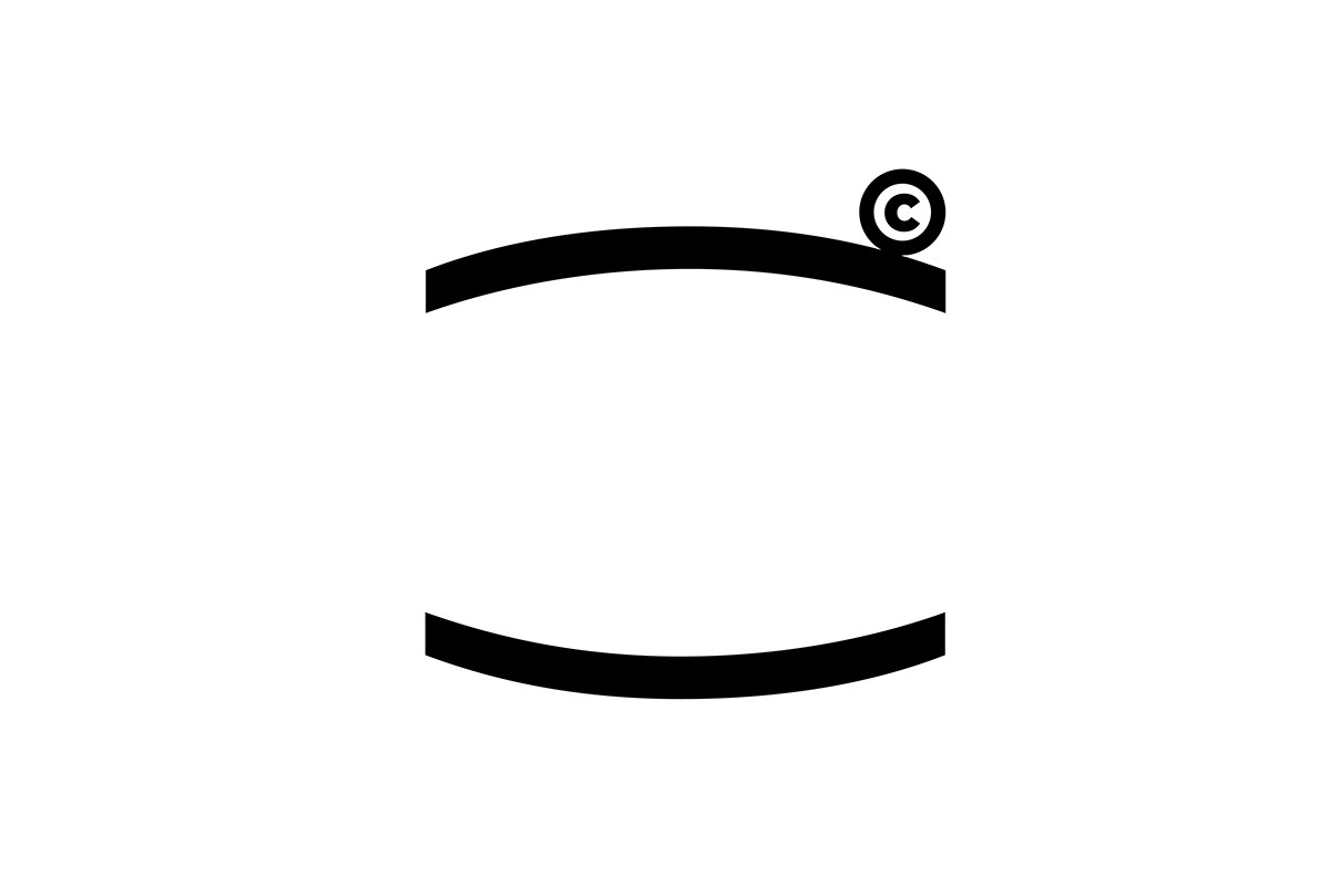
Getting ready for the new store and a fresh brand vibe, we gave the PNC logo a makeover. We wanted it to break free from the usual coffee clichés and be super flexible and functional.
After some serious brainstorming, we settled on the cool concepts of "blank space" and "fillability" for the new logo. This means it can change dynamically based on what's going on, fitting all sorts of needs. Plus, you can tweak the size of the design and text to match your vibe. The "blank space" in the graphic is all about giving off those "undefined" vibes.
The updated logo is all about flexibility and steering clear of being too set in stone, totally in line with PNC's easygoing spirit.
为了迎接新店和新的理念诠释,logo也重新进行了调整。
主理团队希望PNC的logo不被具象的元素和咖啡所定义,能多变和融合并具有一定的功能性。
因此在经过多次讨论后,把“留白”与“可填充”作为新logo的主体概念,
既可以根据内容而变化满足一定的提示和功能需求,并且可根据喜好调整图形与字形之前的比例关系。
也希望能通过图形上“留白”,传达“不被定义”的形象。


Topic Visual
For the store's visual theme, we've chosen the quaint little alley called Qingyun Street, just a short stretch of a few hundred meters. We're blending the essence of "Qingyun" and "Straight" to capture the vibe of our new store - "Going Up Straight Through Qingyun." Beyond the meaningful concept, we want to blend seamlessly with Qingyun Street, introducing more folks to this charming old alley filled with the essence of Guangzhou.
作为开店视觉,我们将一条只有几百米的小巷子青云直街作为主题主体,
并结合“青云”、“直”创造新店的主题-青云直上
除了有美好的寓义之外也希望能与青云直街融合,让更多人知道这个充满广州风情的老巷子。


Sticker
Throughout our trial period, we've whipped up some cool stickers that showcase the distinct vibes of both shops. Each spot has its own unique sticker, and you can slap these on to score a free coffee swap at the other joint. It's a fun way to jazz up our storefronts and give customers a quirky experience, encouraging a friendly exchange between the two stores. Cheers to sticker-powered coffee adventures!
试营业期间结合店面活动,我们设计了几款贴纸,
并将两家店铺的店面形象融合进创作中,
两家店的贴纸各不相同,可使用贴纸到另一家店兑换咖啡


Art Director: Mic Mak
Creative Director:Mic Mak
Designer: Mic Mak
Copywriting:Mic Mak
Client:PNC Coffee


